End-to-End Design · Design System · Branding

The Seasoned Women

A ground-up website design for a Chicago nonprofit helping women build confidence through personal styling.

Live Website
Role

Lead UX Designer

TIMELINE

10 weeks

SKILLS

UX Design

design system

Branding

TEAM

Strategist,

Scrum Lead,

2 Front-End Devs,

2 UX Designers

OVERVIEW

The Seasoned Women is a new nonprofit with no prior presence, no existing content, nothing to build on. Services, positioning, and program names all had to be pulled out of the founder through requirements interviews before the team could design anything.

PROBLEM STATEMENT

How might we launch a first-ever digital presence that establishes credibility and fashion confidence for a brand-new nonprofit, while staying approachable to a broad, undefined audience (women 18+, any life stage) — and gives them a clear path to book, donate,

or volunteer?

RESEARCH & INSIGHTS

Benchmarked NGOs across the US, primarily Illinois, focused on fashion empowerment — mapping which offered 1-1 mentorship, group workshops with sign-up, and donate/volunteer pathways, to see how the category structured these features.


The life-stage framing (Beginning / Building / Return / Flourishing) came from the founder's vision and team brainstorming, not from competitive research — it became the organizing idea for how the site speaks to a broad, undefined audience.


Decisions were validated through founder interviews and founder review, not formal user testing.

Benchmarked NGOs across the US, primarily Illinois, focused on fashion empowerment — mapping which offered 1-1 mentorship, group workshops with sign-up, and donate/volunteer pathways, to see how the category structured these features.


The life-stage framing (Beginning / Building / Return / Flourishing) came from the founder’s vision and team brainstorming, not from competitive research — it became the organizing idea for how the site speaks to a broad, undefined audience.


Decisions were validated through founder interviews and founder review, not formal user testing.

DESIGN PROCESS & sTRATEGY

Information Architecture

Started with a whiteboard brainstorm mapping every page, CTA, and content need against the founder's requirements, then iterated the sitemap three times (v1 → v1 refined → v2) — consolidating from five top-level sections to four and tightening how "Get Involved" branched into Donate, Volunteer, and Sign-up paths.

Started with a whiteboard brainstorm mapping every page, CTA, and content need against the founder’s requirements, then iterated the sitemap three times (v1 → v1 refined → v2) — consolidating from five top-level sections to four and tightening how “Get Involved” branched into Donate, Volunteer, and Sign-up paths.

*Whiteboard brainstorm and sitemap evolution: v1 → v1 refined → v2*

Design System

Explored two directions for the primary brand color — a bold red and a deep burgundy — and landed on burgundy paired with light pink: burgundy for strength, confidence, and boldness, light pink to carry softness and warmth. Typography pairs Instrument Serif for display and headings with Instrument Sans for body copy, kept clean and spacious to stay approachable across a broad age range. A defined type and spacing scale kept the system consistent from wireframe through final UI.
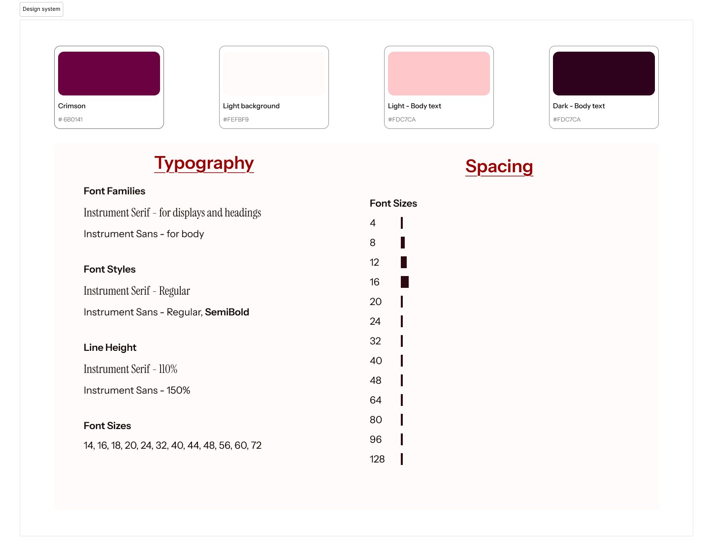
*Color, typography, and spacing system*

Wireframing to Final UI

Moved from low-fi greyscale wireframes (structure only) through color direction, into mid-fi comps, then tested multiple hi-fi homepage variants side by side before landing on final pages. One key pivot came from founder feedback: the original hero was a full-bleed video with text overlaid, but the founder wanted the org's message to lead, so the headline became the primary hero element, with video moved below to support rather than compete with it.

Moved from low-fi greyscale wireframes (structure only) through color direction, into mid-fi comps, then tested multiple hi-fi homepage variants side by side before landing on final pages. One key pivot came from founder feedback: the original hero was a full-bleed video with text overlaid, but the founder wanted the org’s message to lead, so the headline became the primary hero element, with video moved below to support rather than compete with it.

Slide 1
BACK
NEXT

*Low-Fi Wireframe -> Mid-fi Wireframe -> High-fi wireframe*

Component System

Built a reusable component library — button states (default, hover, disabled), navigation links, and card patterns, so the UI stayed consistent across every page and handed off cleanly to the two front-end developers

*Component library — button states, nav components, card variants *

SOLUTION

  1. Home — Leads with the mission promise, then a photo gallery, program preview, testimonials, and a clear CTA to book a session or get involved.


  2. Who We Are — Tells the org's story and the founder's, anchored by four life stages — Beginning, Building, Return, Flourishing — so every visitor sees herself represented.


  3. What We Do — Breaks down the two core services: One-on-One Mentorship (private, in-home styling) and Group Workshops (live, interactive sessions), plus virtual access.


  4. Get Involved — Two clear support paths: Donate (money or clothing) and Volunteer (by role — stylist, photographer, videographer, MUA, seamstress) — so supporters self-select what they can give

  1. Home — Leads with the mission promise, then a photo gallery, program preview, testimonials, and a clear CTA to book a session or get involved.


  2. Who We Are — Tells the org’s story and the founder’s, anchored by four life stages — Beginning, Building, Return, Flourishing — so every visitor sees herself represented.


  3. What We Do — Breaks down the two core services: One-on-One Mentorship (private, in-home styling) and Group Workshops (live, interactive sessions), plus virtual access.


  4. Get Involved — Two clear support paths: Donate (money or clothing) and Volunteer (by role — stylist, photographer, videographer, MUA, seamstress) — so supporters self-select what they can give

Live Website

RESULTS & IMPACT

Donations came in within the first week of the site going live. Early testimonials — gathered from women who'd already worked with the founder before the site existed — echoed back exactly what the design set out to do: feedback consistently called out how clear and crisp the messaging was, and praised the UI itself.


No formal analytics were tracked, so there's no traffic/conversion data to report — first-week donations and direct feedback are the available signal.

Donations came in within the first week of the site going live. Early testimonials — gathered from women who’d already worked with the founder before the site existed — echoed back exactly what the design set out to do: feedback consistently called out how clear and crisp the messaging was, and praised the UI itself.


No formal analytics were tracked, so there’s no traffic/conversion data to report — first-week donations and direct feedback are the available signal.